Android 16 brings a fresh wave of visual enhancements and user experience (UX) refinements, with one standout feature being the introduction of app drawer blur. This subtle yet impactful design change is part of Google’s broader effort to elevate Material Design into its next phase—Material 3 Expressive. If you’re an Android enthusiast or someone who appreciates polished UI interactions, mastering this new blur effect can significantly enhance your daily smartphone experience.
What Is App Drawer Blur?
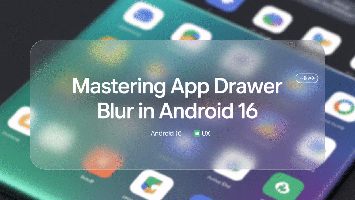
The app drawer blur in Android 16 introduces a soft, frosted-glass aesthetic to the app drawer interface. Instead of a flat, solid background, users are now greeted with a dynamic, blurred backdrop that subtly reflects the home screen beneath it. This visual layering creates a sense of depth and fluidity, making navigation feel more intuitive and immersive .
This blur isn’t just limited to the app drawer—it extends to other system interfaces like the recent apps menu, lock screen PIN entry, and even parts of the Quick Settings panel . The result is a cohesive, visually engaging UI that enhances both usability and aesthetics.
Why It Matters for UX
User experience hinges on more than just functionality—it’s also about how an interface feels. The blur effect in Android 16 contributes to a more polished and modern look while subtly guiding user attention. For instance:
- Visual Hierarchy: The blur helps differentiate between foreground and background elements, allowing users to focus more easily on active content.
- Aesthetic Continuity: With consistent blur effects across multiple screens (such as the app drawer and lock screen), Android 16 feels more unified and thoughtfully designed .
- Reduced Visual Fatigue: The softened backgrounds are easier on the eyes, especially during prolonged use, offering a gentler alternative to stark, high-contrast interfaces.
How to Make the Most of App Drawer Blur
While the blur effect is enabled by default on supported devices like the Pixel 9 and future One UI 7 and Xiaomi HyperOS smartphones, there are a few tips to ensure you’re getting the best possible experience:
- Keep Your System Updated: Android 16 QPR1 Beta 1 introduced some early implementations of the blur, but later updates may refine performance and compatibility .
- Adjust Battery Saver Settings: Note that activating Battery Saver mode disables blur effects to conserve power . If you prefer always-on visuals, consider disabling Battery Saver unless necessary.
- Customize Transparency Levels: Some OEMs, like Xiaomi, are experimenting with varying degrees of transparency in panels and drawers . Explore settings under "Display" or "Home Screen & Gestures" to tweak these effects.
- Pair with Live Wallpapers: The blur effect looks particularly stunning when paired with animated wallpapers that interact with the background, adding motion and life to your UI .
Looking Ahead: A Design Language Evolves
Android 16’s blur effect is more than just eye candy—it’s a sign of things to come. As part of the Material 3 Expressive update, Google is pushing toward a more expressive, emotionally resonant design language that balances utility with beauty . With features like dynamic color palettes, expressive typography, and layered UI elements, Android continues to evolve into a platform that doesn’t just work well—it feels good to use.
In conclusion, the app drawer blur in Android 16 is a small but meaningful step forward in mobile UX design. Whether you’re a casual user or a tech-savvy tinkerer, understanding and embracing this new visual style can make your Android experience more enjoyable, efficient, and visually satisfying. So go ahead—take a closer look at your app drawer. You might just find yourself falling in love with your phone all over again .